Ultraviolet
Redesign Clubs to Boost Revenue
ROLE
Lead Product Designer
COMPANY
Ultraviolet
TIME
Jan 2024 -
Dec 2024
SKILLS
Product Strategy
Retention UX/UI
Hi-Fi Mockups
Design System
TEAM
PM (Kay)
Devs (Jo, Jimmy)
Graphics (Blake)
Ultraviolet is a subscription-based platform that helps creators monetize and connect with their fanbase through exclusive clubs.
OBJECTIVE
The goal of this project was to make it easier for creators to manage their club and monetize their fanbase, by shifting the product focus toward media. Ultraviolet’s existing mission and features weren’t compelling enough to drive creator or member engagement, and this redesign aimed to change that.
IMPACT
Exclusive media selling became the top used feature on Ultraviolet, making up for 40% of the app’s revenue
77% of creators reported more engagement in their clubs
DELIVERABLES
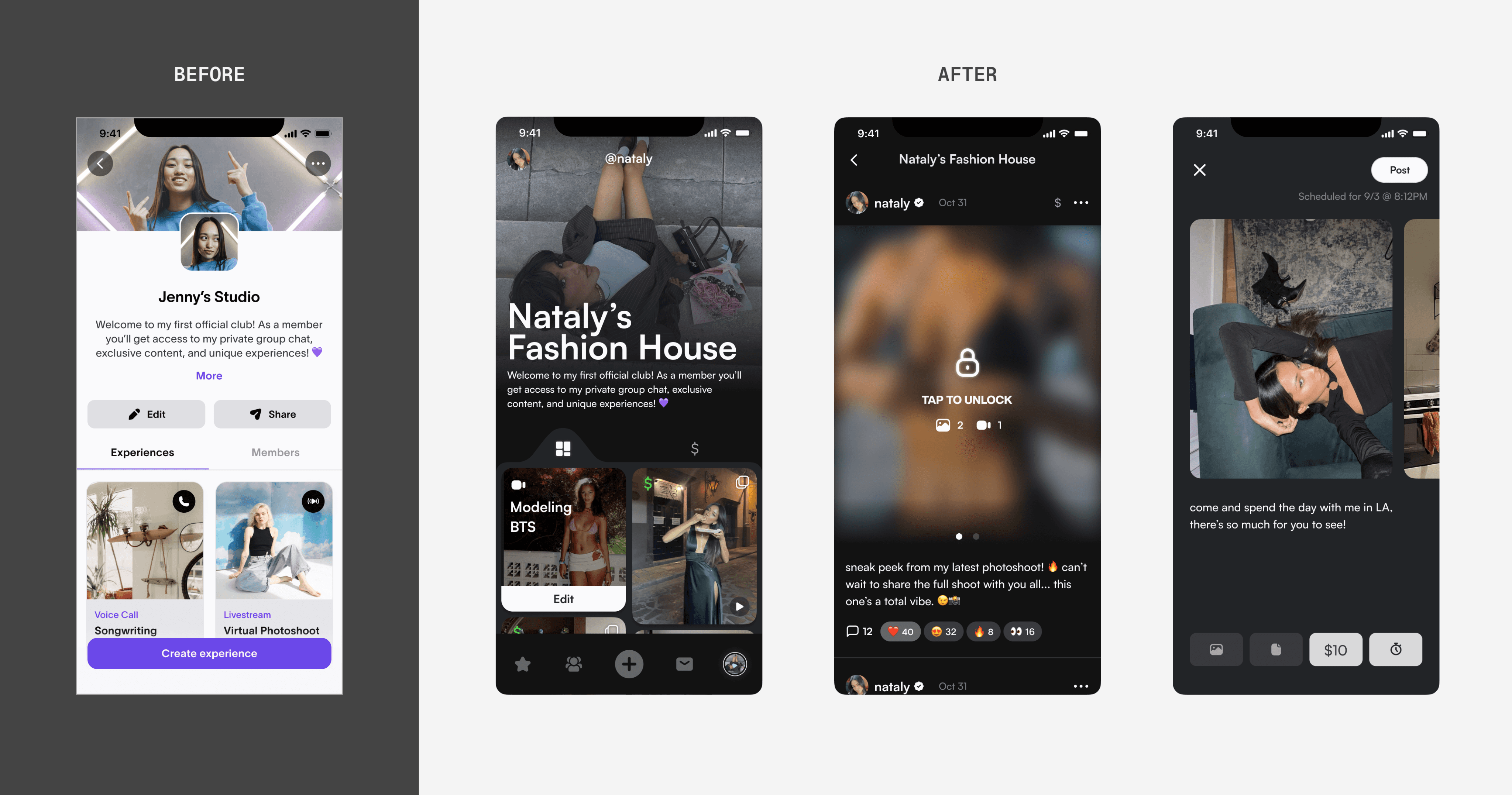
When I joined Ultraviolet in August 2022, the app was in beta with a basic foundation in place. My task was to design the end-to-end experience of posting media content, a feature I aimed to position as the platform’s most valuable offering.
Over the course of 7 months, and alongside a full app redesign, this feature evolved into our top revenue driver and a core part of the product experience.
👀 Tired of looking through case studies? Jump to see the pretty solution pictures
PROBLEM
Pain Points
Deep online connection for users felt intimidating
New creators find it difficult to create content for their club
Members were disappointed with in club subscriptions
This project began after our beta launch, when we realized our mission, to build genuine connections between creators and fans, needed a more accessible entry point. Many of these online users were hesitant to engage in direct conversation, as they were more familiar with consuming media, the core experience on their most frequently used platforms like Instagram or TikTok.
At the same time, we saw that media was a clear path to revenue for creators. That insight led us to double down on a media-first strategy, one that still supported community, but made media the front door for both engagement and monetization.
“My job is usually to post content online and fans interact with it. I’m intimidated to have to chat or call with my fans. It’s a certain intimacy I’m not used to.” - Creator on Ultraviolet
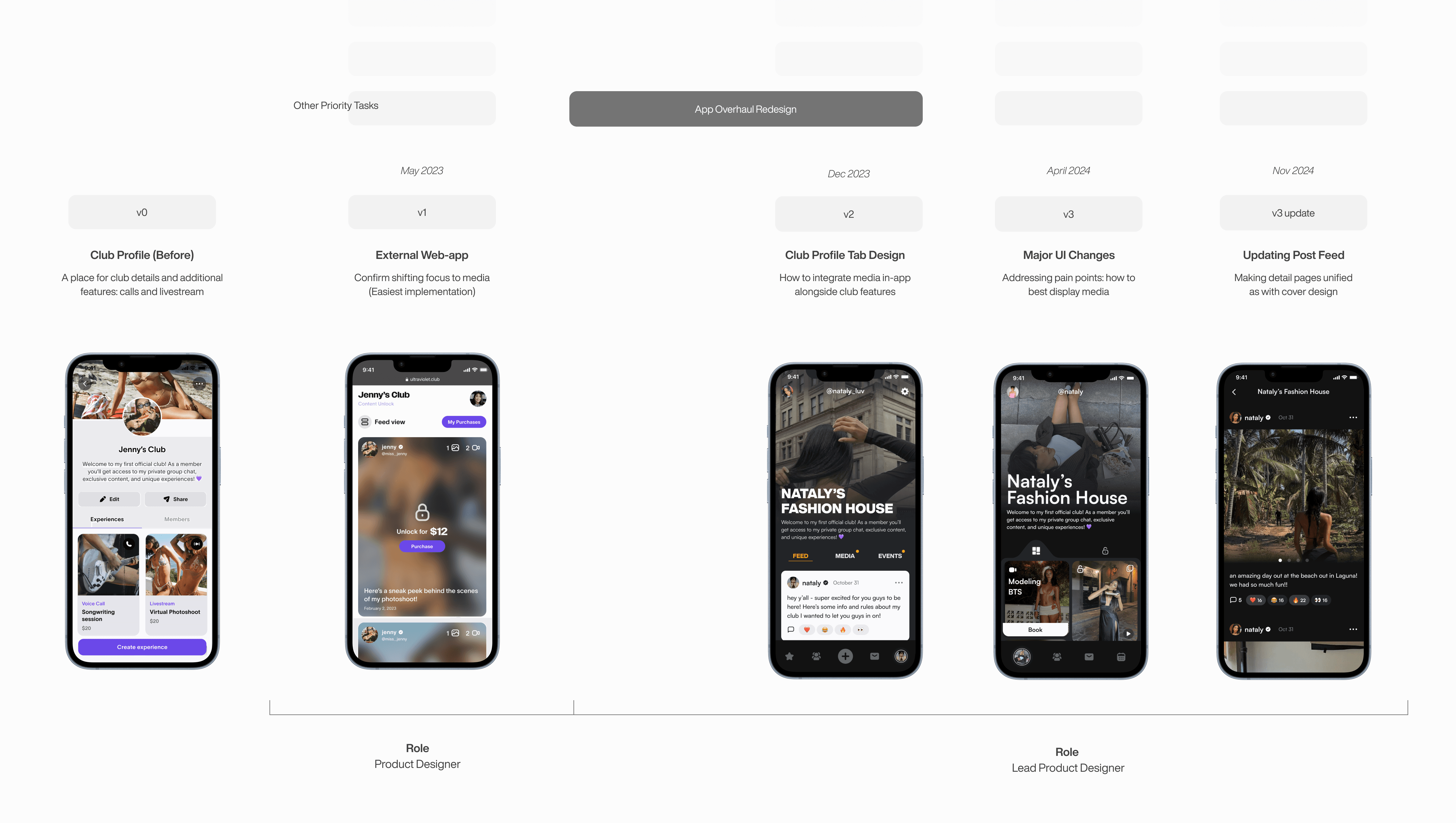
FIRST ITERATION
Selling Media through Webapp
Before diving into design, we needed to validate our hypothesis: could media become a scalable, effective way for creators to earn more revenue? What types of media made sense, and what features were creators already expecting?
I started by mapping out a basic media flow for both user types. For creators, the experience needed to be simple and familiar: a clear path to upload and sell content. For members, the flow had to preserve a sense of connection and value without making the club feel like a paywall.
I referenced platforms like Instagram and TikTok to understand familiar media-sharing patterns, while pulling from models like OnlyFans and Patreon to evaluate content monetization. This helped anchor the feature in user expectations while shaping it into something uniquely tailored to how Ultraviolet worked.
The most logical place for media to live was within the Club Profile, but due to limited dev resources, stakeholder pressure, and a need to avoid Apple’s in-app fees, the dev team and I chose to build it as a web app, accessed via a CTA in the Club Profile.
From a design standpoint, I kept the UI simple and consistent, using a two-column grid layout for the media, familiar component sizing, and the same text input styles used in the app. This made development smoother and ensured the web experience still felt native to the platform.
This was actually my first feature project as a Product Designer at Ultraviolet—a real “big girl” moment. I owned it end-to-end, from mapping user behavior to designing for edge cases and presenting tradeoffs to stakeholders. I also worked closely with engineering to scope around tight constraints while still maintaining a seamless experience within our existing system.
After launch, it became clear that creators were eager to use the feature. Once they started posting, we saw media directly drive both engagement and revenue. Even during beta, clubs that posted regularly retained more members and earned more. This pattern showed up in both user feedback and internal data.
This validated the shift I had pushed for: moving toward a media-first strategy. The project became the foundation for future work and changed how we approached the creator experience. Not just by adding media, but by rethinking how clubs could feel intuitive and rewarding from day one.
SECOND ITERATION
Transform Media In-App
With media proving to be a clear driver of value, we were ready to bring the feature fully in-app. This next iteration rolled out alongside a full app overhaul and rebrand — a fast-moving effort to redesign every major feature and flow in under three months, during which I stepped into the role of Lead Product Designer.
Given the scope and timeline, I focused on high-impact changes that could improve the creator experience without overextending our limited resources. Every decision had to balance ambition with feasibility, and I worked closely with engineering to align on what we could realistically ship.
GOALS FOR CLUB PROFILE
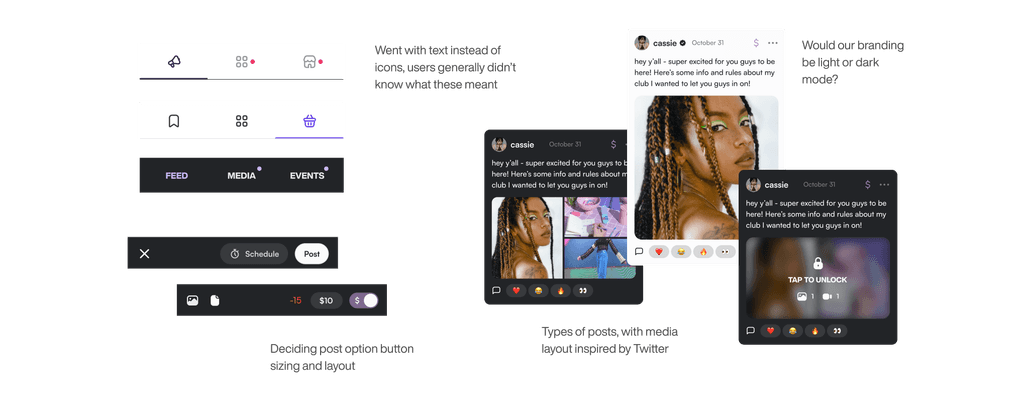
Introducing Feed
One of the core additions in this iteration was the feed, a new space for creators to post both media and text. Group chat had become overloaded with all types of communication, from paid content drops to simple updates, which made it hard for members to keep track of what mattered. The feed offered a clearer, more persistent space to share intentionally. We also introduced a media tab as an alternate view, giving members a clean way to browse only the media content shared in the club.

A major inspiration for the feed was Twitter, a familiar format that blends media and text in a lightweight, scrollable layout. I explored similar structures in early wireframes and proposed design directions to stakeholders and developers, focusing on how the feed would live inside the Club Profile and connect to the upload experience.
To refine the UI, I went through multiple rounds of iteration, designing within real constraints. We couldn’t support video or file uploads at launch, and there wasn’t bandwidth for layered views or dynamic overlays. I kept the visuals simple and solid to reduce dev lift, using flat components and native patterns that could ship faster while still feeling cohesive. These tradeoffs shaped how the first version of the feed came together: stripped down, but intentional.


After launching the Club Profile redesign, we saw a strong uptick in engagement. Creators responded positively to having a more structured space to share content, stakeholders were aligned on the direction, and revenue grew by 200 percent as more creators joined the platform. User satisfaction also improved, confirming we were heading in the right direction.
But within a month, as more creators came onboard, unexpected issues started to surface. We had assumed the feed would become the core posting space, but usage told a different story.
Text-based posting felt intimidating
Many creators weren’t sure when or what to post in the feed, especially with a group chat already in place. Without clear guidance or examples, posting felt redundant or awkward, and many skipped it entirely.
Empty tabs signaled inactivity
While some creators used livestreams or calls, most didn’t host events regularly. That left the Events tab visibly empty, making clubs feel abandoned and discouraging member engagement.
The UI didn’t support early-stage clubs
The three-tab layout assumed every club would have regular content in each section. When tabs were empty, the profile felt incomplete, which hurt credibility and reduced both creator and member engagement.
This version of the feed leaned more heavily into text-based posts than our earlier concepts. At the time, it felt like a logical move. Structured updates gave creators space to explain their offerings and build trust. But with usage data and feedback in hand, it became clear that this approach wasn’t aligned with how most of our content creators naturally engaged.
We already knew media was the strongest driver of activity, and this iteration had drifted from that. So I started rethinking the UI through a more media-first lens, exploring how the feed could visually prioritize image/video content, reduce the emphasis on text, and better support lightweight, visual posting.
I worked with our PM, Kay, to break down the key issues into concrete UI problems and identify simple, high-impact solutions we could move on quickly.

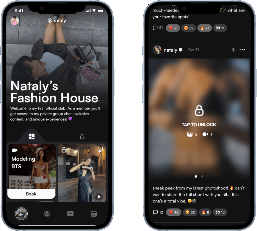
FINAL ITERATION
Refining The Viewing Experience
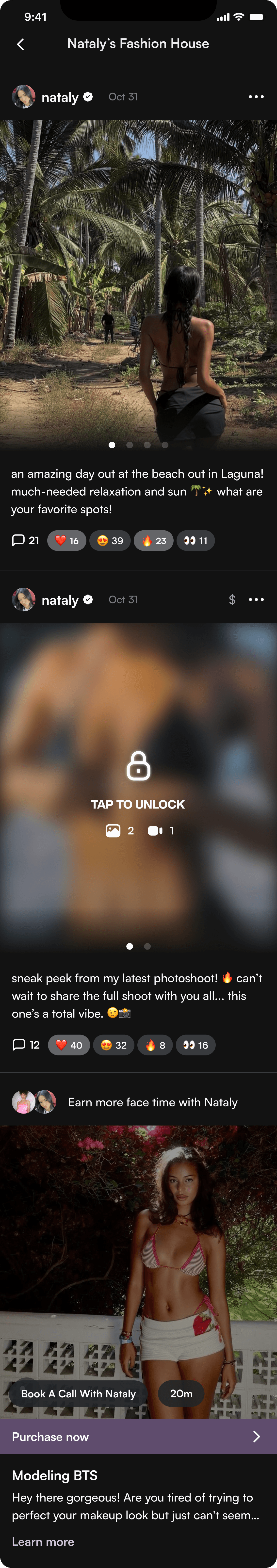
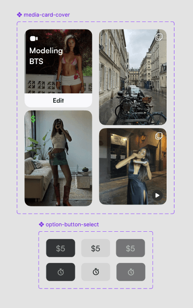
Media-Centric Club Profile
Unified feed for all post types (free, paid, events)
More useful tabs: All vs. Locked (paid) content
Neutral design that adapts to any club brand
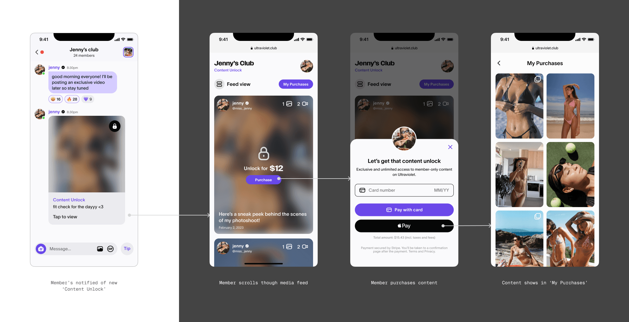
Detailed Post View
Each post allows members an opportunity for engagement in reactions and comments.
Ad Look for Events
Since we don’t expect clubs with more than 3 events at once based on previous data, we wove calls and livestreams into the feed, positioning them to look more like ads.
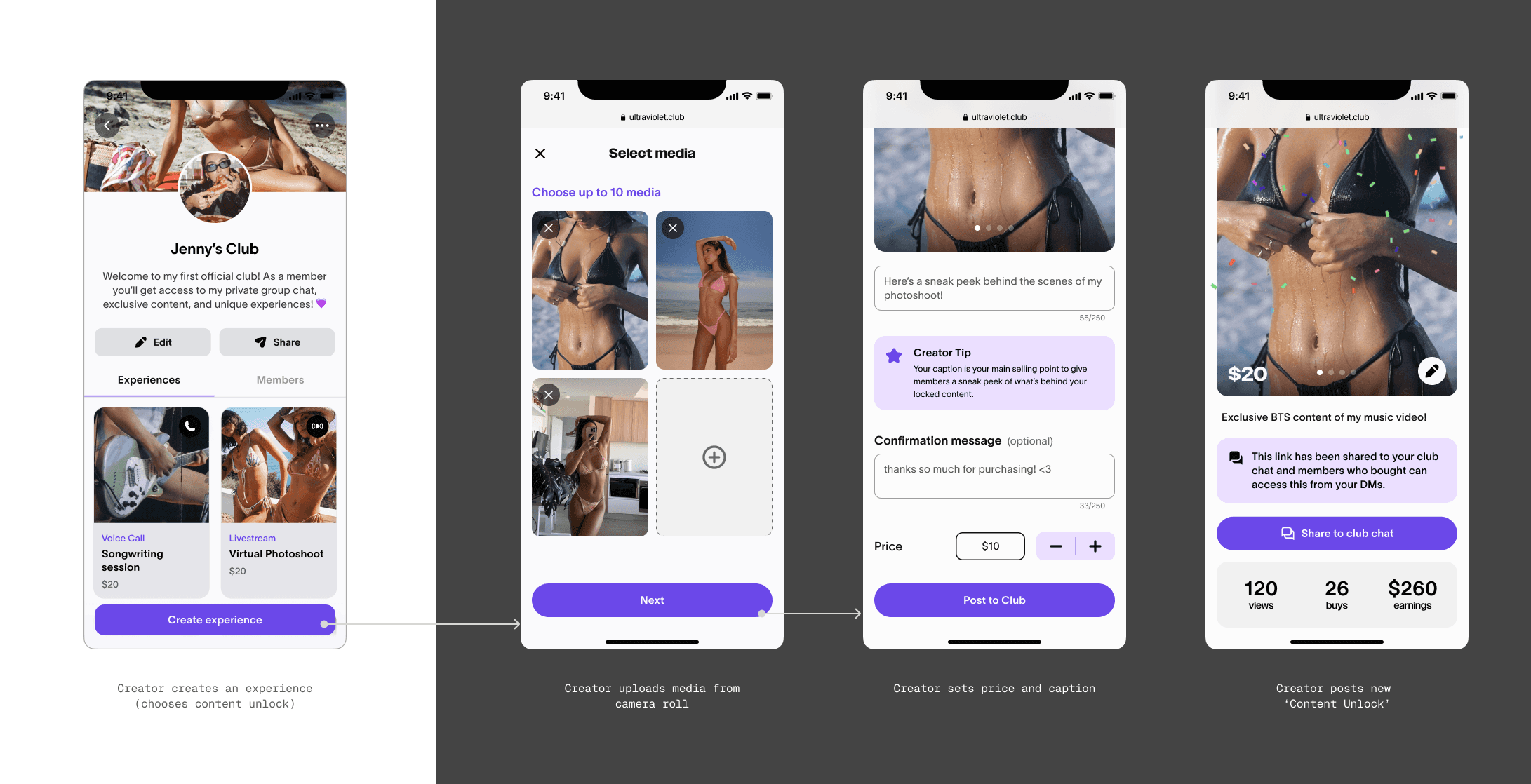
Creating A Post
Easy toggle to list post for sale
Schedule feature for creators who plan their posts ahead
Comes with a story asset to help promote the club on social media
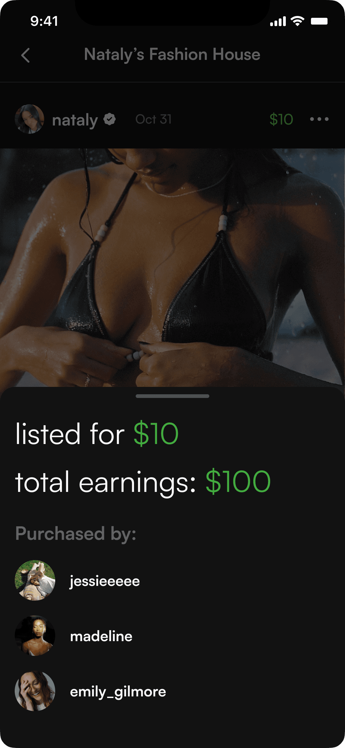
Insights for Sold Media
Creators can use this information to analyze how well their posts are performing, and gauge their media profitability
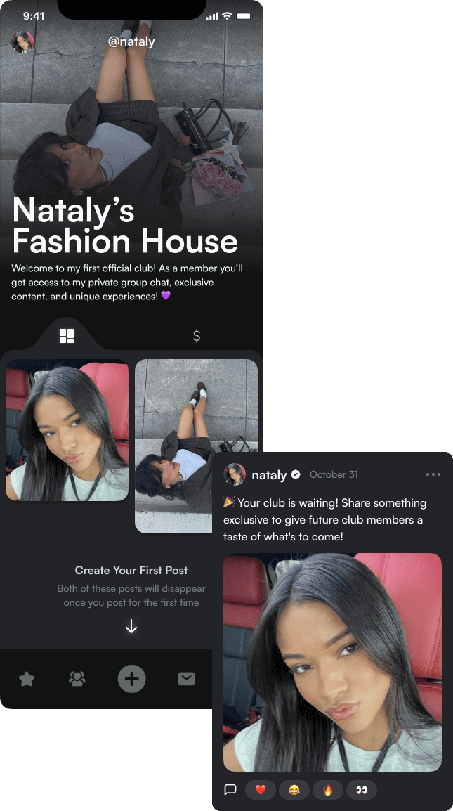
Informative Seeded Posts
To support onboarding and avoid empty clubs, we introduced seeded posts that educate and inspire creators on how a club should look.
Components + Grids
Added every part of this feature into our design system to ensure all components and styles are consist, and keep track of variants.
And as always, we kept our designs in a soft 8pt grid combined with column structured screens in a way that’s flexible, yet logical to develop.
IMPACT
The Results Are In
As much as I’d love to show you definitive numbers of how we succeeded, there was a slight issue in that we were also building and releasing other features and iterations of features overlapping one another, each interfering with the data of another. However! I can tell you this:
Exclusive media selling became the top used feature on Ultraviolet, making up for 40% of the app’s revenue
Plus, we also had a lot of user feedback and internal feedback of our progress. Here’s a few quotes we gathered:
“I used to hesitate before subscribing, but now everything looks professional and put-together. It makes a difference.”
“The new club layout makes my page feel so much more premium and professional. It actually reflects my brand now.”
Creator A
Creator B
Member C
“It’s so much easier to manage everything now. I don’t feel like I’m juggling too many features I don’t use.”
REFLECTION
My Concluding Thoughts
I had the privilege of being involved in every step of this process, and it was incredibly gratifying to be one of the key contributors to the company’s turnaround in profitability. It took some time for me to step back and fully appreciate the impact I made so early in my career, and I’m deeply grateful to Justin and Brian for trusting me to lead this project.
Looking back, it’s clear how crucial media is in capturing the attention of today’s users. It’s what powers explore pages, drives first impressions, and holds the most value in any creator-focused space. I do believe that the ability to integrate clean, balanced design around media is essential to the future of successful digital platforms.
A huge thank you to the team who helped bring this to life. It was a privilege to work alongside you. Thank you for your patience, support, and belief in me during my time at Ultraviolet.
contact me at catalxsm@gmail.com


