Ultraviolet
Streamlining Onboarding Success

ROLE
Lead Product Designer
COMPANY
Ultraviolet
TIME
Sep 2023 - Jul 2024
SKILLS
B2C Acquisition
User Mapping
Prototyping
Usability Testing
TEAM
PM (Kay)
Devs (Jimmy, Jonathan)
Mktg (Isaiah)
Graphics (Blake)
Data (Aabid)
Ultraviolet is a subscription-based platform that helps creators monetize and connect with their fanbase through exclusive clubs.
OBJECTIVE
Our goal was to help creators quickly understand what Ultraviolet offers, guide them through the unfamiliar process of launching a club, and reduce drop-off throughout the flow.
IMPACT
43% increase in 7-day retention
Creators who finished onboarding were 20% more likely to launch a club in their first week
DELIVERABLES
I was responsible for designing the end-to-end onboarding experience for both members and creators at Ultraviolet (this case study focuses on the creator side).
Over a 10-month span, I designed and shipped flows, collaborated on UX copy and visuals, and prototyped in Figma. I worked closely with PMs and engineers to prioritize versions and iterated based on user insights gathered with our marketing team.
This onboarding launched alongside a full app redesign and directly improved short-term retention by helping more creators successfully launch their clubs.
👀 Tired of looking through case studies? Jump to see the pretty solution pictures
PROBLEM
Pain Points

Heavy reliance on human guidance

Long and clunky multi-step process

Lack of guidance afterwards
Our onboarding asks a lot from creators, there’s absolutely no way getting around it when half of it is new behavior. So when it’s met with a long and confusing process, creators would quit before making it to their ultimate goal: launching a club on Ultraviolet.
To quickly compensate for the poor experience, our Creator Partnerships Team stepped in—personally guiding creators through onboarding setup and follow through to a club launch. This made onboarding a silent bottleneck. It technically existed, but relied too heavily on manual intervention to be effective at scale. And if creators without human guidance didn’t launch, they didn’t bring in fans, which meant no subscriptions, no engagement, and no revenue.
In this case study, I’ll share how I transformed onboarding into a scalable, self-serve experience, one that empowers creators to launch independently.

A few snapshots from our past onboarding
Design Process
The Current User Landscape
After observing how closely creators interacted with our partnerships team, I wanted to establish a baseline understanding of our users. I worked with marketing to focus on what the different types of creators entering the app, and the context or expectations they brought into the experience.
Impulsive Clicker

“I just want to see what this is to make money”
Cautious Evaluator

“Let’s see what this app can offer for my career”
Serious Committer

“I’m ready to build my club”
1. The Impulsive Clicker: Often coming from a social post or ad, this person sees an app with potential to make money—but doesn’t understand how it works. They download our app out of curiosity immediately but they didn’t prepare any patience for the process. They go through onboarding, they skim, skip, and write the bare minimum just to see what’s inside the app. If things take too long, too much text, or doesn’t feel unclear, they quit. They make up for half of creators entering the app, and rarely have success with launching a club.
2. The Cautious Evaluator: This person either heard about the app from a trusted source or did some light research through our socials and website. They believe it could be useful to their career, sounds like something of interest, but they’re not convinced yet. Once they download the app, they evaluate it quickly—judging every few seconds if it feels credible, polished, and worth their time. If it meets their expectations and understanding, they’re willing to complete onboarding thoughtfully. They make up for a third of these incoming creators, and rarely have success with launching a club.
3. The Serious Committer: These creators are sourced from our Creator Partnerships team, who offer personalized walkthroughs and guidance of how Ultraviolet can directly support their content and audience. They understand the value, are committed to launching a club, and are motivated to get set up properly. They have the patience and the 1-on-1 guidance that allows them to finish onboarding. They make up a small percentage of our creators, but have the highest success rate for a club launch.
This taught me that onboarding doesn’t need to be one-size-fits-all. While most creators came in as Type 1, we focused the experience around Type 2 and 3, the ones motivated to launch and sustain a club. But Type 1 still taught us something: speed matters.
We didn’t need heavy explanations, since most serious creators (Types 2 and 3) had already done the research before downloading. So we focused on making onboarding quick to parse, with just enough guidance and clear action items to get set up fast.
Feature Narrative
Sign up
This is where we ask for a user’s phone number (preferred) or email to log in. It lets us create an account tied to a contact method and gives us a way to reach them if they drop off.
General Onboarding (Profile)
This step is straightforward: profile photo, username, name, and age verification. Most creators are familiar with providing these details, so it’s quick and easy to complete.
Club Setup
This is the first step that introduces a new behavior: creating a club. Here, creators set up their club’s basic info, and choose their subscription pricing.
Share Club
The final step in onboarding is an educational page that explains how to launch a club by promoting it on social media—a critical step we rely on creators to take themselves.
Post-Onboarding Guidance
Lastly, we added short-term retention tools to support creators post-onboarding, knowing that launching a club rarely happens in one sitting.
Journey Map UX Flow
Using the feature narrative as our foundation, we mapped out the user experience with a few key considerations:
Tailoring the flow to different user personas and their patience levels
Striking a balance between clarity and cognitive load aka enough info to understand the app without overwhelming
Consolidating steps to make onboarding feel faster
Leveraging notifications to re-engage users who drop off, using their preferred sign-up method

Design System Integration
As I designed the flow, I reviewed each step against our existing components: auditing their use cases, refining error and loading states, and updating them to align with our new branding.

SOLUTIONS (BEFORE + AFTER)
Sign Up
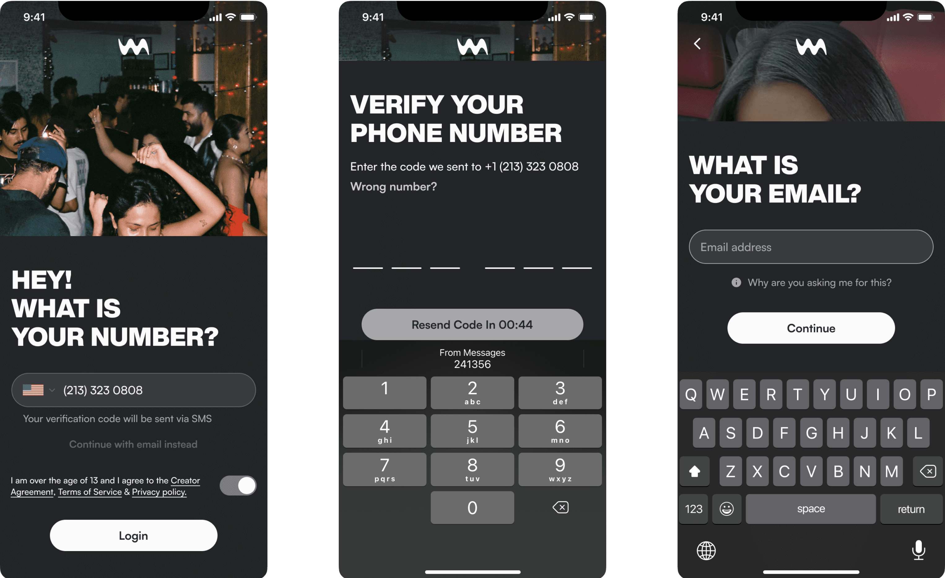
( HOVER ABOVE FOR A BEFORE LOOK )
We saw that nearly 75% of users dropped off during onboarding (a scary number to see, I know). I knew many of them were Type 1 creators we weren't targeting, but what about the others? The ones who had potential but were hesitant to try something new?
After noticing that phone number is a common and familiar sign-up method, I and our data team advocated for a phone-based sign-up flow (with email as a secondary option). It gave users a fast, familiar entry point, and it allowed us to collect contact info early. This became a soft catch point. Even if users dropped off, we could follow up. Around 6 to 8 percent of those creators later returned and finished onboarding. While that number seems low, each club had the potential to earn anywhere from $1k to $10k per month, so every returning creator mattered.
We also saw long-term value in collecting phone numbers and emails. In an earlier version of the redesign, we had deprioritized out-of-app notifications but quickly realized that phone numbers let us send critical updates, and emails gave us a direct channel for feature announcements to our most dedicated creators.
On another note, to reduce early friction, we combined the Terms of Service agreement and 13+ age check into a single checkbox on the first screen. These were two low-value steps that didn’t need to be separated. By front-loading simple requirements, we made the rest of the flow feel faster and more focused, saving user energy for the moments that actually required thought.
Onboarding (Profile)


( HOVER ABOVE FOR A BEFORE LOOK )
This section was fairly straightforward and didn’t require major changes. We focused on trimming unnecessary steps and updating the visuals to match the new branding. Easy.
The one key change was making a profile picture mandatory for both creators and members. For creators, having a picture allowed us to personalize the visuals later in onboarding, helping the experience feel custom and getting them more excited about their club. For members, leaving profile pictures optional had resulted in many accounts using the generic default image. This made clubs feel less credible and left creators uneasy about how their space appeared to others.
Plus, for both user types, a profile picture wasn’t too much to ask. Most were already used to having accounts on social media, so this felt like a natural step.
Club Setup

( HOVER ABOVE FOR A BEFORE LOOK )
During moderated testing of our original flow, I noticed that many creators stalled during Club Setup. Faced with too many input fields and not enough direction, they hesitated or dropped off entirely. I flagged this as a key friction point and pushed to redesign the experience.
Two core problems emerged. First, the sheer number of input fields and no context created cognitive overload. Second, creators weren’t sure how to fill out the fields, mainly because they weren’t sure what their club was for. Even those familiar with our features hadn’t fully connected them to their own brand or strategy. This hesitation often came down to one question: “What am I actually going to do in my club?”
To address this, I restructured Club Setup into three lightweight steps, focused only on the core info needed to launch. Then, to give creators more direction, I proposed a niche selection screen upfront. That input was used to auto-generate a club name and bio tailored to them. This gave impatient creators a quick path through setup, and more intentional creators something solid to build from.
The result was a setup flow that felt faster, clearer, and more personal. Creators now had a sense of direction from the start, without needing to build their club identity from scratch.
What we did:
Smart defaults: Autofilled club name and bio suggestions based on the creator’s selected niche to inspire and reduce effort
Pricing guidance: Recommended pricing tiers based on proven monetization patterns
Progress indicator: Gave creators a clear sense of momentum through setup
Micro-guidance: Added tooltips and contextual hints to minimize guesswork
Share Club

( HOVER ABOVE FOR A BEFORE LOOK )
Club promotion on Ultraviolet relies on creators sharing their club link through social media. When a fan clicks the link, they land on a purchase page, subscribe, join the app, and become a member. Success depends on creators actively promoting their club to drive membership.
We needed to solve two things: first, help creators understand why promotion matters and how to do it, especially during onboarding when they’re just learning how the system works. Second, we had to make it easy to take action later on, giving them a place in the app they could revisit any time they needed a refresher or wanted to re-engage.
To support onboarding, I introduced a short motion video that walks through how the club link works, why it matters, and how sharing fuels member growth. Right after the video, creators land on the Share Club page for the first time, reinforcing what they just learned with a real, actionable step.
We used that same Share Club page as the version that lives permanently in the app, to create consistency and avoid maintaining separate versions. It was designed around three simple actions: copy your club link, use pre-made story assets, and access social media shortcuts. Each tap reveals quick guidance on what it is and how to use it, giving creators a reliable tool they can return to any time.
What we did:
Pre-made share assets to make promotion quicker and easier
Quick-share shortcuts to major social apps for seamless posting
Actionable tips on where to share (e.g. bio link, story swipe-ups, pinned comments)
In-App Guidance
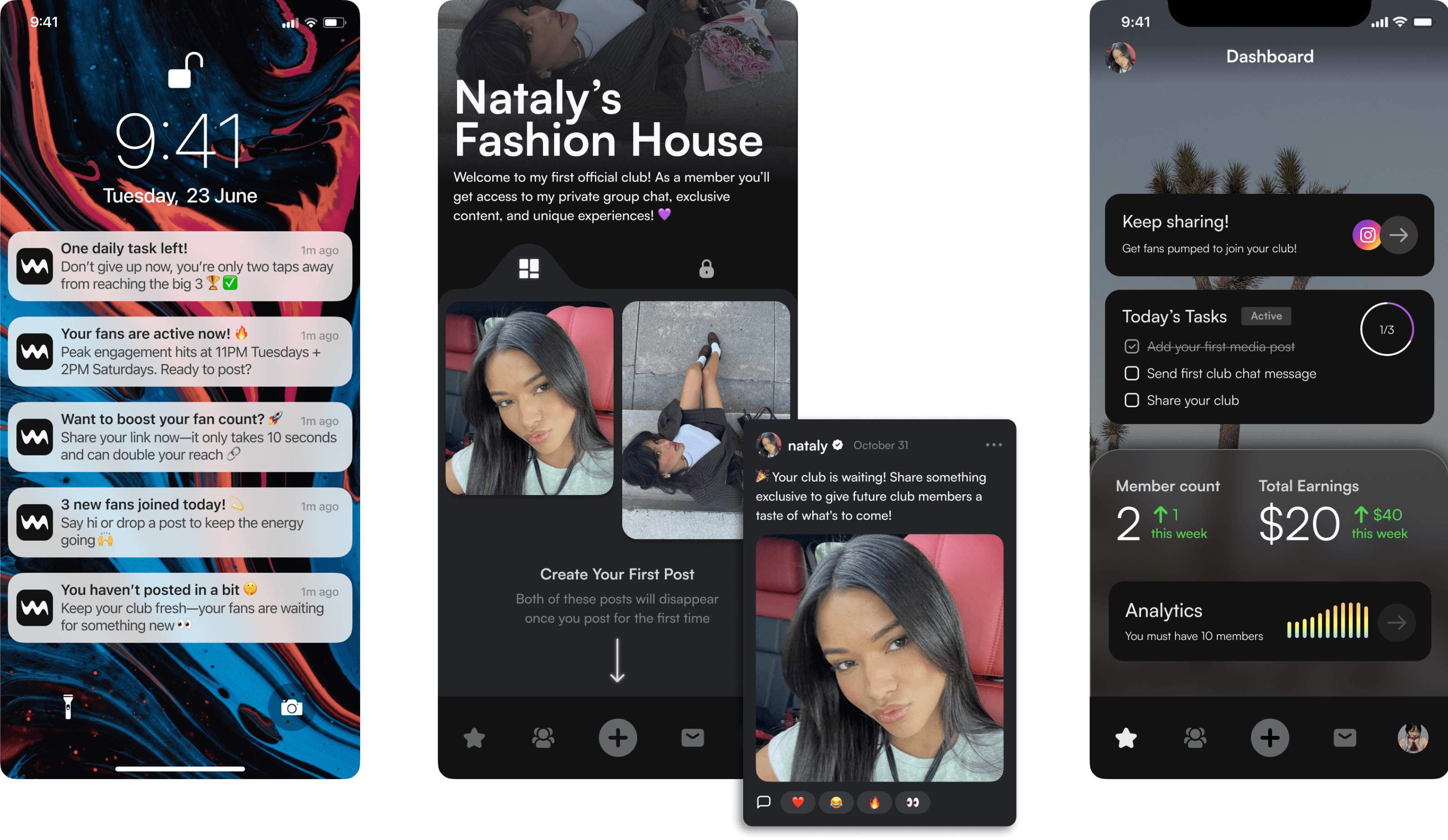
( HOVER ABOVE FOR A BEFORE LOOK )
After our first live version of onboarding, we saw an increase in users completing the flow, but very little change in actual club launches. In our moderated testing group, we found many creators didn’t know what to do once they entered the app. There were too many features and no clear direction.
I quickly noticed the disconnect between our immediate goal of getting users through onboarding and our bigger goal of helping creators launch. Kay (our PM) and I strongly advocated for post-onboarding guidance as the next critical step.
Our goal was to support creators across three early phases: preparing for launch, the launch itself, and the first few stages of managing a club. We focused on building momentum through small, low-effort actions like content prompts, promotion reminders, and a dashboard that surfaced tasks needing attention.
What we did:
Seeded content and empty states to prompt ideas for posts and showcase what kind of content creators could share
A dashboard task list that helped creators complete important setup steps, like creating their first post, messaging in the club chat, or heading back to the Share Club page
Targeted prompts and notifications to build confidence, encourage consistent promotion, and alert creators when a member was waiting on them in DMs
VARIANTS
Error States

Empty States

Top row is Creators POV, bottom row is Members POV
TESTING
The Results Are In
4
Creators
2
Rounds of Moderated Testing
65
Survey Answers
WHAT THEY LIKED
Creators were able to complete onboarding without manual guidance and understood the purpose of each step (yay for our creator partnerships team!)
The flow felt easy to navigate, and most creators completed it in under three minutes.
WHAT COULD USE IMPROVEMENT
Small UI and copy tweaks, like better button placement and shorter descriptions, noticeably improved clarity. But there's still room to simplify and guide users more intuitively.
Creators continued to ask for stronger post-launch guidance. Many wanted a more tutorial-led experience to help them understand how to use different features across the app. (Something of note for future iterations with our engineers!)
Discoverability came up often. Creators wanted to see real-life examples of other clubs for inspiration, and more social proof that the app works and is worth investing in.
SOLUTION
Final Onboarding Prototype
The main onboarding steps including Phone Number Sign-Up, Profile Creation, and Club Creation.
REFLECTION
My Concluding Thoughts
This was one of the most complex flows I’ve worked on. Most of the time, onboarding feels relatively straightforward for apps. But when I started researching how other products approach it, it only reinforced the realization that Ultraviolet is no ordinary platform. Here, we’re asking creators to learn and adopt entirely new behavior from the ground up.
That alone is incredibly difficult. So when we see only a small percentage of creators make it through, it can feel discouraging. But I remind myself that our goal is long-term success for selected dedicated creators. We’re building for creators who are ready to commit, and that means accepting that this app isn’t for everyone.
I’m really interested to see how the app continues to evolve for long-term retention, and how AI might support that. Whether through auto-generating content templates, suggesting first messages, or analyzing club performance to offer actionable insights, anything that makes managing a club easier can give creators a better shot at success.
Prioritizing early retention drove 7-day retention up to 43%.
Creators who finished onboarding were 20% more likely to launch a club in their first week
contact me at catalxsm@gmail.com

